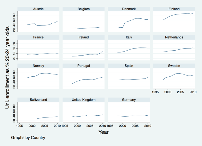
We were discussing the causes of ‘market inequality’ in class today. Amongst other things, we discussed the importance of skill-biased technological change. This led some people to wonder what the comparative data looks like on higher education enrolment across countries. If there is rising demand for skilled workers, have some countries been better at meeting this demand than others?
I wondered, and so went to the Eurostat web site. From the ‘Population and social conditions’ theme, I got hold of what seems like a reasonable proxy for university enrolment figures from the ‘Education and training’ section, and then figures for the number of people in the 20-24 age cohort for each country. Taking the ratio of the two, multiplied by 100, I then calculate an (approximate) enrolment rate for each country.
Without further comment on the reliability of the calculations or what the appropriate inferences are, I offer, below, the plots for these data for the countries that seem to be of most direct interest for the class. (No population data available for the USA from Eurostat, I’m afraid. I’m sure it’s available elsewhere, but I’m not going to look for it.)
If you would like to look at the original data and/or see the Stata code that merges it and then generates the plot, try the following: pop2024.csv, unienrol.csv, and highereducation.do.
